

How India’s national flower, the Namaste gesture and the colours of BRICS come together to represent resilience, equality and collective growth
As India hosts the 18th BRICS Summit in New Delhi on September 12–13, 2026, the country’s BRICS chairship has been given a visual identity that seeks to bring together India’s civilisational heritage and the contemporary spirit of international cooperation.
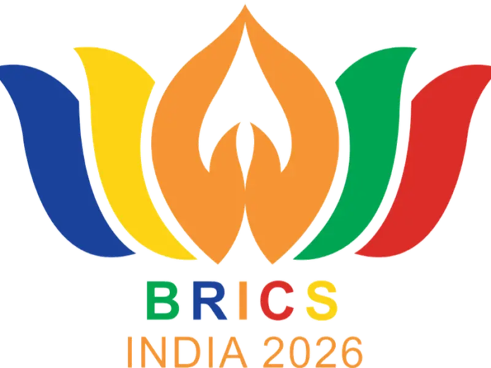
The BRICS India 2026 logo is built around a lotus-inspired form, with its petals extending outward to create a vibrant and distinctive representation of the expanded BRICS grouping. More than a graphic identity for India’s year as chair, the design reflects themes of unity, resilience, inclusivity and cooperation that lie at the heart of India’s BRICS vision.
The lotus at the heart of the design
The most prominent element of the logo is its lotus-inspired shape. The lotus is India’s national flower and has deep cultural and civilisational significance in the country.
In the BRICS India 2026 visual identity, the lotus represents resilience, renewal and growth. Its symbolism is particularly significant because the flower grows and blooms despite emerging from challenging conditions. In the context of India’s BRICS chairship, the lotus therefore conveys an idea of strength and renewal while connecting the global diplomatic platform with India’s cultural identity.
The use of the lotus also gives the logo an unmistakably Indian character while keeping its overall design contemporary and international.
The Namaste gesture
At the centre of the logo is another distinctly Indian element. Two petals are shaped to resemble joining hands in the traditional Namaste gesture.
Namaste is widely associated with greeting, respect and warmth in Indian culture. Its incorporation into the BRICS logo symbolises mutual respect, equality and harmonious collaboration among participating countries.
The gesture also reinforces the people-centric character of India’s approach to its BRICS chairship. Rather than representing cooperation only at the level of governments and institutions, the visual identity presents dialogue and togetherness as central to the broader relationship between nations and peoples.
A design that represents unity in diversity
Radiating outward from the centre are multiple colourful petals. The colours incorporated into the design represent the BRICS member countries, bringing their distinct identities together within a single visual form.
This arrangement communicates the idea of unity in diversity. Each element retains its individual character while contributing to a larger whole.
The symbolism is particularly relevant to the contemporary BRICS grouping, which has expanded considerably from its original membership and now brings together countries from different regions, cultures and economic backgrounds.
The logo therefore seeks to visually represent the principle that cooperation does not require uniformity. Instead, different countries can come together while retaining their individual identities.
Connecting tradition with a global vision
The BRICS India 2026 logo combines traditional Indian symbolism with a modern visual language. The lotus and Namaste establish a clear connection with India’s cultural heritage, while the outward-facing arrangement of the petals conveys openness, cooperation and collective progress.
The visual identity is aligned with India’s broader BRICS 2026 vision of sustainable development, inclusivity, dialogue and togetherness for global welfare.
It also complements the theme of India’s BRICS chairship: “Building for Resilience, Innovation, Cooperation and Sustainability.” The theme and logo together present India’s approach to the grouping as one that seeks to connect economic and technological progress with sustainability, dialogue and human welfare.
More than a summit symbol
The logo is ultimately more than an identity for a two-day leaders’ summit. It represents India’s year-long role as chair of BRICS and its effort to bring together the group’s diverse members around common areas of cooperation.
Through the lotus, Namaste and the colourful petals, the design places Indian cultural identity alongside the wider ideals of equality, partnership and collective growth.
As leaders of BRICS countries gather in New Delhi, the logo will serve as a visual reminder of the central message India seeks to convey through its chairship: that resilience and progress can be strengthened through dialogue, diversity and cooperation, with a shared focus on global welfare.